
Navigation
To navigate across pages you can use either breadcrumb or wordpress page navigator. By using breadcrumb, the admin application will not reload the script, just switch among views.

Page lists
- Main page
- Form list page
- Form details page
- Email list page
- Email details page
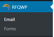
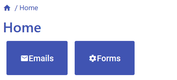
Main page
You will find two big buttons:
- “Email” will navigate to Email list page
- “Forms” will navigate to Form list page
Email list page
On this page you can find a list of the received emails. You can easily filter your emails by email address or subscription.If you select some emails you can either export or delete them.
Email details page
On this page you see first the main variables after that the list of all variables.
Finally you see your regenerated email. Be careful, if something has changed on the form, it will not show the same content as in the sent email!
Form list page
On this page you will find all of your forms listed in a table.
You can add new forms with the + Create button, give a name to your form and click on create.
By clicking on the Open pre-created form list you can add a complete form to your list, which you can edit.
If you click on the import button, an import panel will show up, and you can put your earlier form into it and import it to your current site. So you can use the same form on as many sites as you want.
By clicking on the eye icon, you can open the settings.
With the export button (square with arrow) you can export your form in json format.
If you want to delete a form click on the red bin.
Form details page
On this page you will find your form option tabulators:
- Settings
- Email configuration
- Styles
- Content
- Specials
Settings tab
At the top, you see a shortcode. The plugin works only if you copy and paste it into your page.
Here you will find some basic options and price settings.
If you enable the price counter, you will able to configure that.
Below the price setting panel, you will find a unique counter which is only enabled in the premium version. The price counter basically summarizes all price values and subtracts all discounts after.
Here is a detailed list of the inputs:
- Name: forms name
- After successfully submitted text: when the user successfully submitted a form this message appears
- After unsuccessfully submitted text: when the user unsuccessfully submitted a form this message appears
- Date format in EMAIL: set a date format type in the email
- Date format in FORM: set a date format type in the form
Price and currency
- Add price: choose yes if you want to include a price
- Currency symbol / name: insert currency symbol or name
- Currency symbol / name position: the symbol or name can be placed before or after numbers
- Note after whole counted price: add a note after whole counted price
- Note after whole discount: add a note after whole discount, discount per card
- Note after whole counted price- whole counted discount: discounted price
Email configuration tab
In this tab, you can configure email settings: set header and footer. For that, you can use some special elements (it will be replaced with the signed value) and HTML elements (enabled HTML codes are listed).
You can add response opportunities (acceptance or denial) to user emails. If the user clicks on a response button, a landing page appears, which you can configure through a response shortcode.
In the premium version, you can add an alert function: the admin gets an email when the user accepted or denied the sent email.
- Title: emails title
- Admin email: email address of the admin
- Sender name and email: email address and name by whom the email was sent
- Send admin/user email: set who should receive an email after submitting the form
- Allowed HTML codes and allowed HTML codes: here is a list of the allowed codes
- Email header: insert a text
- Email footer:insert a text
- Email response: default setting is no
- Email response URL: that is the URL of the email response
- Accept button text and Reject button text: modify if you want
Styles tab
Here you can find the style options. There are many basic styles and some input types have special options.
To see changes, navigate to the page which contains your form and refresh that.
There are some pre-created style sheets, that you can use.
As inputs, you can use the basic color picker or/and RGB color codes.
Content tab
In this tab, you can create the content.
A form consists of three main elements: columns, cards, and questions.
This structure is very useful if you want to create a responsive form because on each display you can set different resolutions.
If you want to know more about the resolution system, click here to see grid system help.
- Column: This is the biggest unit, cards can only be placed in here. Inside one column there can be more cards.
- Card: This is the medium unit. Inside one card you can place more questions.
- Question: This is the smallest unit. Be careful there are some required questions, what you have to put in your form.
We developed this method so you can arrange similar questions on a card.
Moreover, with this structure you can create a responsive design because you can set each element flexible to each screen resolution.
With the drag and drop system the form can be easily modified.
Column
This is the main component of the form.
You can add more cards and different resolution settings (max 12) to a column. This will dinamically show on the building page.
Options
- Size S–L: it sets the size of column if the screen size is S-L, click to see more on grid system help
Card
A card consists of two parts: header and content
You can add more questions, either basic or special ones to your card.
Important to keep in mind: the plugin only checks the questions validation rules (for example: requirement) if either the card is required or the user opens the card.
Options
- Required: with this option you can select the card and content obligation.
- Yes: the card and it’s content (questions) are visible.
- No: cards content is hidden, if the user doesn’t open the content (and questions). It won’t be required even if questions are required. (If the user opens it, the plugin checks the questions obligations. )
- Connecting to input: whole card is only visible if the connecting input value is an exact match with the predefinied connected value.
- Connecting input id: here you can enter the ID of the question with which the card will be linked
- Connecting input value: here you can enter the value of the question with which the card will be linked
- Size S-L: it sets the size of the card if the screen size is S-L, click to see more on grid system help
- Title: set the title
- Note after cards whole price: add a note after the total price, but only if there are price questions and the main price counter is enabled.
- Note after cards whole discount: add a note after the total discount, but only if there are discount questions and the main price counter is enabled
Question
The settings may differ depending on type of question
- Size S-L: it sets the size of question if the screen size is S-L, click to see more on grid system help
- Set as special element: set an element as a special element which have a special behavior. To see more detailed describition click here.
- Question title: set the question title
- Required: set the question’s obligation.
- Yes: to submit the form the question is required (unless the question’s card is optional and was not opened)
- Required alert text: set an alert text, which appears if your customer tries to send the form without answering this question.
- Input pattern text: add a text, which appears until the user clicks on the input field.
- Note (only in the form): add a note which appears when the user clicks on the input and disappears when the user starts typing.
- Note (only in the email): add a note which appears after the question.
Question - general inputs
- Text
- Textarea
- Range
- Select
- Ratio
- Check
W3S input types: click here to find the describtions to the basic questions
Question - special inputs
- Gender: here the user selects his/her gender and the email will select an appropriate invocation.
- Email: emails always have a special pattern validation. All forms must include an email, because the plugin always checks that.
- Address: it consists of basic text inputs, but these inputs have a special style, and can be easily recognised by their ids.
- PickDate: this is a calendar, where you can disable specific weekdays or add an extra price to them.
- Accept and send form questions: all forms have to include this field, because it includes terms and conditions.
Special ids
There are some predefined functions what you can use with defined special ids.
But there is one rule: one special id can only be placed once in a form.
- last_name,first_name,telephone,email: these are inserted in the emails header, footer and appear on the email list page.
- gender: it is placed in the emails header, footer.